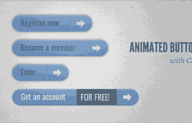

ANIMATED BUTTONS 室用css3打造的一款多种动画样式的按钮,它的灵感来自于作者想用不同的样式创造一些动态的链接元素,鼠标移动到按钮上和激活按钮都呈现不同的样式。
接下来我们就来说明每个按钮的效果是怎么来实现的,也可参见示例下载中的源码
Demo1 的实现过程
AnimatedButtons_01
1、html代码
<a href="#" class="a-btn">
    <span class="a-btn-slide-text">$29</span>
    <img src="images/icons/1.png" alt="Photos" />
    <span class="a-btn-text"><small>Available on the Apple</small> App Store</span>
    <span class="a-btn-icon-right"><span></span></span>
</a>
2、按钮样式
.a-btn{
    background: linear-gradient(top, #a9db80 0%,#96c56f 100%);
    padding-left: 90px;
    padding-right: 105px;
    height: 90px;
    display: inline-block;
    position: relative;
    border: 1px solid #80ab5d;
    box-shadow:
        0px 1px 1px rgba(255,255,255,0.8) inset,
        1px 1px 3px rgba(0,0,0,0.2);
    border-radius: 4px;
    float: left;
    clear: both;
    margin: 10px 0px;
    overflow: hidden;
    transition: box-shadow 0.3s ease-in-out;
}
.a-btn img{
    position: absolute;
    left: 15px;
    top: 13px;
    border: none;
    transition: all 0.3s ease-in-out;
}
.a-btn .a-btn-slide-text{
    position: absolute;
    font-size: 36px;
    top: 18px;
    left: 18px;
    color: #6d954e;
    opacity: 0;
    text-shadow: 0px 1px 1px rgba(255,255,255,0.4);
    transition: opacity 0.2s ease-in-out;
}
.a-btn-text{
    padding-top: 13px;
    display: block;
    font-size: 30px;
    text-shadow: 0px -1px 1px #80ab5d;
}
.a-btn-text small{
    display: block;
    font-size: 11px;
    letter-spacing: 1px;
}
.a-btn-icon-right{
    position: absolute;
    right: 0px;
    top: 0px;
    height: 100%;
    width: 80px;
    border-left: 1px solid #80ab5d;
    box-shadow: 1px 0px 1px rgba(255,255,255,0.4) inset;
}
.a-btn-icon-right span{
    width: 38px;
    height: 38px;
    opacity: 0.7;
    border-radius: 20px;
    position: absolute;
    left: 50%;
    top: 50%;
    margin: -20px 0px 0px -20px;
    border: 1px solid rgba(0,0,0,0.5);
    background: #4e5c50 url(../images/arrow_down.png) no-repeat center center;
    box-shadow:
        0px 1px 1px rgba(255,255,255,0.3) inset,
        0px 1px 2px rgba(255,255,255,0.5);
    transition: all 0.3s ease-in-out;
}
3、鼠标移动到按钮上时的样式
.a-btn:hover{
    box-shadow:
        0px 1px 1px rgba(255,255,255,0.8) inset,
        1px 1px 5px rgba(0,0,0,0.4);
}
.a-btn:hover img{
    transform: scale(10);
    opacity: 0;
}
.a-btn:hover .a-btn-slide-text,
.a-btn:hover .a-btn-icon-right span{
    opacity: 1;
}
4、鼠标按下时的css样式
.a-btn:active {
    position:relative;
    top:1px;
    background:#80ab5d;
    box-shadow:1px 1px 2px rgba(0,0,0,0.4) inset;
    border-color: #a9db80;
}
.a-btn:active .a-btn-icon-right span{
    transform: scale(1.4);
}
Demo2 的实现过程
AnimatedButtons_02
第二个效果其实和第一个效果有些类似,只是我们要加上一些不同的效果。
html代码和按钮样式都基本上是一样的,只是把颜色变一下即可,但是按钮的激活和覆盖样式是不一样的
3、当鼠标移动到按钮上时的样式为
.a-btn:hover{
    box-shadow:
        0px 1px 1px rgba(255,255,255,0.8) inset,
        1px 1px 5px rgba(0,0,0,0.4);
}
.a-btn:hover img{
    opacity: 0;
}
.a-btn:hover .a-btn-slide-text{
    opacity: 1;
    transform: scale(1);
}
.a-btn:hover .a-btn-icon-right span{
    opacity: 1;
    background-color: #bc3532;
}
4、鼠标按下时的样式为
.a-btn:active {
    position: relative;
    top: 1px;
    background: #5d81ab;
    box-shadow: 1px 1px 2px rgba(0,0,0,0.4) inset;
    border-color: #80a9da;
}
.a-btn:active .a-btn-icon-right span{
    transform: rotate(360deg);
}
Demo3 的实现过程
AnimatedButtons_03
这个效果将会与上面的两个彻底的不一样了,当鼠标移动到按钮上时,按钮就会向下扩展并且显示另外一则信息,方向图标将会有一定程度的旋转。
1、html代码
<a href="#" class="a-btn">
<span class="a-btn-text">Register now</span>
<span class="a-btn-slide-text">Get a promotion</span>
<span class="a-btn-icon-right"><span></span></span>
</a>
2、按钮样式
.a-btn{
    background: linear-gradient(top, #feda71 0%,#febb4a 100%);
    border: 1px solid #f5b74e;
    border-color: #f5b74e #e5a73e #d6982f;
    box-shadow: 0 1px 1px #d3d3d3, inset 0 1px 0 #fee395;
    padding: 0px 80px 0px 10px;
    height: 38px;
    display: inline-block;
    position: relative;
    border-radius: 4px;
    float: left;
    margin: 10px;
    overflow: hidden;
    transition: all 0.3s linear;
}
.a-btn-text{
    padding-top: 5px;
    display: block;
    font-size: 18px;
    white-space: nowrap;
    color: #996633;
    text-shadow: 0 1px 0 #fedd9b;
    transition: all 0.3s linear;
}
.a-btn-slide-text{
    position:absolute;
    top: 35px;
    left: 0px;
    width: auto;
    right: 52px;
    height: 0px;
    background: #fff;
    color: #996633;
    font-size: 13px;
    white-space: nowrap;
    font-family: Georgia, serif;
    font-style: italic;
    text-indent: 15px;
    overflow: hidden;
    line-height: 30px;
    box-shadow:
        -1px 0px 1px rgba(255,255,255,0.4),
        1px 1px 1px rgba(0,0,0,0.5) inset;
    transition: height 0.3s linear;
}
.a-btn-icon-right{
    position: absolute;
    right: 0px;
    top: 0px;
    height: 100%;
    width: 52px;
    border-left: 1px solid #f5b74e;
    box-shadow: 1px 0px 1px rgba(255,255,255,0.4) inset;
}
.a-btn-icon-right span{
    width: 38px;
    height: 38px;
    opacity: 0.7;
    position: absolute;
    left: 50%;
    top: 50%;
    margin: -20px 0px 0px -20px;
    background: transparent url(../images/arrow_right.png) no-repeat 50% 55%;
    transition: all 0.3s linear;
}
3、鼠标移动到按钮上时的样式
.a-btn:hover{
    height: 65px;
    box-shadow: 0px 1px 1px rgba(255,255,255,0.8) inset, 1px 1px 5px rgba(0,0,0,0.4);
}
.a-btn:hover .a-btn-text{
    text-shadow: 0px 1px 1px rgba(0,0,0,0.2);
    color: #fff;
}
.a-btn:hover .a-btn-slide-text{
    height: 30px;
}
.a-btn:hover .a-btn-icon-right span{
    opacity: 1;
    transform: rotate(-45deg);
}
4、鼠标按下时按钮的样式
.a-btn:active {
    position:relative;
    top:1px;
    background: linear-gradient(top, #fec354 0%,#fecd61 100%); /* W3C */
    border-color: #d29a3a #cc9436 #c89133;
    text-shadow: 0 1px 0 #fee1a0;
    box-shadow: 0 1px 1px #d4d4d4, inset 0 1px 0 #fed17e;
}
Demo4 的实现过程
1
个人比较喜欢这个效果,当我们鼠标移动到按钮上时,按钮通过向右滑动扩展出一块区域来显示额外的内容,很好看的按钮动画效果。
1、html代码
<a href="#" class="a-btn">
<span class="a-btn-text">Register now</span>
<span class="a-btn-slide-text">Get a promotion</span>
<span class="a-btn-icon-right"><span></span></span>
</a>
2、按钮样式
.a-btn{
    background: linear-gradient(top, #80a9da 0%,#6f97c5 100%);
    padding-left: 20px;
    padding-right: 80px;
    height: 38px;
    display: inline-block;
    position: relative;
    border: 1px solid #5d81ab;
    box-shadow:
        0px 1px 1px rgba(255,255,255,0.8) inset,
        1px 1px 3px rgba(0,0,0,0.2),
        0px 0px 0px 4px rgba(188,188,188,0.5);
    border-radius: 20px;
    float: left;
    clear: both;
    margin: 10px 0px;
    overflow: hidden;
    transition: all 0.3s linear;
}
.a-btn-text{
    padding-top: 5px;
    display: block;
    font-size: 18px;
    white-space: nowrap;
    text-shadow: 0px 1px 1px rgba(255,255,255,0.3);
    color: #446388;
    transition: all 0.2s linear;
}
.a-btn-slide-text{
    position:absolute;
    height: 100%;
    top: 0px;
    right: 52px;
    width: 0px;
    background: #63707e;
    text-shadow: 0px -1px 1px #363f49;
    color: #fff;
    font-size: 18px;
    white-space: nowrap;
    text-transform: uppercase;
    text-align: left;
    text-indent: 10px;
    overflow: hidden;
    line-height: 38px;
    box-shadow:
        -1px 0px 1px rgba(255,255,255,0.4),
        1px 1px 2px rgba(0,0,0,0.2) inset;
    transition: width 0.3s linear;
}
.a-btn-icon-right{
    position: absolute;
    right: 0px;
    top: 0px;
    height: 100%;
    width: 52px;
    border-left: 1px solid #5d81ab;
    box-shadow: 1px 0px 1px rgba(255,255,255,0.4) inset;
}
.a-btn-icon-right span{
    width: 38px;
    height: 38px;
    opacity: 0.7;
    position: absolute;
    left: 50%;
    top: 50%;
    margin: -20px 0px 0px -20px;
    background: transparent url(../images/arrow_right.png) no-repeat 50% 55%;
    transition: all 0.3s linear;
}
3、鼠标移动到按钮上时的样式
.a-btn:hover{
    padding-right: 180px;
    box-shadow: 0px 1px 1px rgba(255,255,255,0.8) inset, 1px 1px 3px rgba(0,0,0,0.2);
}
.a-btn:hover .a-btn-text{
    text-shadow: 0px 1px 1px #5d81ab;
    color: #fff;
}
.a-btn:hover .a-btn-slide-text{
    width: 100px;
}
.a-btn:hover .a-btn-icon-right span{
    opacity: 1;
}
4、鼠标按下时按钮的样式
.a-btn:active {
    position: relative;
    top: 1px;
    background: #5d81ab;
    box-shadow: 1px 1px 2px rgba(0,0,0,0.4) inset;
    border-color: #80a9da;
}
Demo5 的实现过程
AnimatedButtons_05
这个效果将会当我们把鼠标移动到按钮上时,左侧的箭头将会循环向下运动。
1、html代码
<a href="#" class="a-btn">
<span class="a-btn-symbol">Z</span>
<span class="a-btn-text">Download Now</span>
<span class="a-btn-slide-text">Windows Vista / Windows 7</span>
<span class="a-btn-slide-icon"></span>
</a>
2、按钮样式
@font-face {
    font-family: 'WebSymbolsRegular';
    src: url('websymbols/websymbols-regular-webfont.eot');
    src: url('websymbols/websymbols-regular-webfont.eot?#iefix') format('embedded-opentype'),
        url('websymbols/websymbols-regular-webfont.woff') format('woff'),
        url('websymbols/websymbols-regular-webfont.ttf') format('truetype'),
        url('websymbols/websymbols-regular-webfont.svg#WebSymbolsRegular') format('svg');
    font-weight: normal;
    font-style: normal;
}
.a-btn{
    border-radius: 50px;
    padding: 10px 30px 10px 70px;
    position: relative;
    float:left;
    display: block;
    overflow: hidden;
    margin: 10px;
    background: linear-gradient(top, rgba(255,255,255,1) 0%,rgba(246,246,246,1) 74%,rgba(237,237,237,1) 100%);
    box-shadow:
        0px 0px 7px rgba(0,0,0,0.2),
        0px 0px 0px 1px rgba(188,188,188,0.1);
    transition: box-shadow 0.3s ease-in-out;
}
.a-btn-symbol{
    font-family: 'WebSymbolsRegular', cursive;
    color: #555;
    font-size: 20px;
    text-shadow: 1px 1px 2px rgba(255,255,255,0.5);
    position:absolute;
    left: 20px;
    line-height: 32px;
    transition: opacity 0.3s ease-in-out;
}
.a-btn-text{
    font-size: 20px;
    color: #d7565b;
    line-height: 16px;
    font-weight: bold;
    font-family: "Myriad Pro", "Trebuchet MS", sans-serif;
    text-shadow: 1px 1px 2px rgba(255,255,255,0.5);
    display: block;
}
.a-btn-slide-text{
    font-family: Arial, sans-serif;
    font-size: 10px;
    letter-spacing: 1px;
    text-transform: uppercase;
    color: #555;
    text-shadow: 0px 1px 1px rgba(255,255,255,0.9);
}
.a-btn-slide-icon{
    position:absolute;
    top:-30px;
    width: 22px;
    height: 22px;
    background: transparent url(../images/arrow_down_black.png) no-repeat top left;
    left:20px;
    opacity: 0.4;
}
3、鼠标移动到按钮上时的样式
.a-btn:hover{
    background: #fff;
    box-shadow:
        0px 0px 9px rgba(0,0,0,0.4),
        0px 0px 0px 1px rgba(188,188,188,0.1);
}
.a-btn:hover .a-btn-symbol{
    opacity: 0;
}
.a-btn:hover .a-btn-slide-icon{
    -webkit-animation: slideDown 0.9s linear infinite;
}
4、鼠标按下时按钮的样式
.a-btn:active{
    background: #d7565b;
    box-shadow:
        0px 2px 2px rgba(0,0,0,0.6) inset,
        0px 0px 0px 1px rgba(188,188,188,0.1);
}
.a-btn:active .a-btn-text{
    color: #fff;
    text-shadow: 0px 1px 1px rgba(0,0,0,0.3);
}
.a-btn:active .a-btn-slide-text{
    color: rgba(0,0,0,0.4);
    text-shadow: none;
}
5、最后有一个动画的样式
@keyframes slideDown {
    0% { top: -30px; }
    100% { top: 80px;}
}
Demo6 的实现过程
AnimatedButtons_06
1、html代码
<a href="#" class="a-btn">
<span></span>
<span>Sign up</span>
<span>It's free!</span>
</a>
2、按钮样式
.a-btn{
    width: 120px;
    height: 120px;
    border-radius: 50%;
    display: block;
    margin: 20px;
    float: left;
    background: #f0ad4e;
    position: relative;
    box-shadow:
        0px 0px 5px 0px rgba(246, 212, 163, 0.5) inset,
        0px -1px 5px 4px rgba(170, 77, 27, 0.2) inset,
        0px 0px 0px 7px #fff,
        0px 0px 1px 8px rgba(188, 188, 188, 0.4),
        0px 0px 0px 9px #fff;
    transition: all 0.3s linear;
}
.a-btn span{
    display: table-cell;
    width: 80px;
    height: 80px;
    padding: 20px;
    text-align: center;
    vertical-align: middle;
    font-size: 26px;
    color: #fff;
    text-shadow: 0px 1px 1px #A03F16;
    font-family: "Arvo", "Myriad Pro", "Trebuchet MS", sans-serif;
    transition: all 0.3s linear;
}
.a-btn span:nth-child(1),
.a-btn span:nth-child(3){
    position: absolute;
    top: 0px;
    left: 0px;
    font-size: 40px;
    line-height: 36px;
    opacity: 0;
}
.a-btn span:nth-child(1){
    background: transparent url(../images/star.png) no-repeat center center;
    opacity: 0.2;
}
3、鼠标移动到按钮上时的样式
.a-btn:hover{
    background: rgba(170, 77, 27, 0.6);
    box-shadow:
        0px 0px 5px 0px rgba(246, 212, 163, 0.5) inset,
        0px -1px 5px 4px rgba(170, 77, 27, 0.2) inset,
        0px 0px 0px 7px #fff,
        1px 4px 5px 8px rgba(188, 188, 188, 0.6),
        0px 0px 0px 9px #fff;
}
.a-btn:hover span:nth-child(3){
    opacity: 1;
}
.a-btn:hover span:nth-child(2){
        transform: scale(0);
    opacity: 0;
}
.a-btn:hover span:nth-child(1){
    animation: rotate 1s linear;
}
4、鼠标按下时按钮的样式
.a-btn:active{
    box-shadow:
        0px 0px 5px 0px rgba(246, 212, 163, 0.5) inset,
        0px -1px 5px 4px rgba(170, 77, 27, 0.2) inset,
        0px 0px 0px 7px #fff,
        0px -1px 0px 8px rgba(188, 188, 188, 0.3),
        0px 0px 0px 10px #fff;
}
.a-btn:active span:nth-child(2){
    color: rgba(170, 77, 27, 0.8);
    text-shadow: 0px 1px 1px rgba(255, 255, 255, 0.6);
}
5、动画样式
@-webkit-keyframes rotate{
    0% { transform: scale(1) rotate(0);}
    50% { transform: scale(0.5) rotate(180deg);}
    100% { transform: scale(1) rotate(360deg);}
}
Demo7 的实现过程
AnimatedButtons_07
1、html代码
<a href="#" class="a-btn">
<span></span>
<span>Sign up</span>
<span>It's free!</span>
</a>
2、按钮样式
.a-btn{
    border-radius: 10px;
    padding: 10px 30px 10px 70px;
    position: relative;
    float:left;
    display: block;
    overflow: hidden;
    margin: 10px;
    background: linear-gradient(top, #b7f2f4 0%,#7ce7ea 100%);
    border: 1px solid #90c6c8;
    border-color: #90c6c8 #78bdc0 #65b6ba;
    box-shadow:
        0px -5px 0px 0px #458a8c,
        0 1px 1px #d5d5d5,
        0 1px 0 rgba(255,255,255,0.8) inset;
    transition: all 0.2s linear;
}
.a-btn-symbol{
    font-family: 'WebSymbolsRegular', cursive;
    color: #437b7d;
    text-shadow: 0 1px 0 #bef3f5;
    font-size: 20px;
    position:absolute;
    left: 20px;
    width: 20px;
    text-align: center;
    line-height: 32px;
    transition: all 0.3s ease-in-out;
}
.a-btn-text{
    font-size: 20px;
    color: #437b7d;
    text-shadow: 0 1px 0 #bef3f5;
    line-height: 16px;
    font-weight: bold;
    font-family: "Myriad Pro", "Trebuchet MS", sans-serif;
    display: block;
}
.a-btn-slide-text{
    font-family: Arial, sans-serif;
    font-size: 10px;
    letter-spacing: 1px;
    text-transform: uppercase;
    color: #555;
    text-shadow: 0px 1px 1px rgba(255,255,255,0.9);
}
3、鼠标移动到按钮上时按钮的样式
.a-btn:hover{
    transform: scale(1.05);
}
.a-btn:hover .a-btn-symbol{
    opacity: 0.5;
    transform: rotate(360deg);
}
4、鼠标按下时按钮的样式
.a-btn:active{    transform: scale(0.95);    box-shadow:         0px 0px 0px 1px #458a8c,         0 1px 1px #d5d5d5, inset 0 1px 0 rgba(255,255,255,0.8),        0px 1px 1px 2px #fff;
}
讨论这个项目(3)回答他人问题或分享插件使用方法奖励jQ币 评论用户自律公约


- 😀
- 😉
- 😥
- 😵
- 😫
- 😘
- 😡
- 👍
- 🌹
- 👏
- 🍺
- 🍉
- 🌙
- ⭐
- 💖
- 💔
- 😀
- 😉
- 😥
- 😵
- 😫
- 😘
- 😡
- 👍
- 🌹
- 👏
- 🍺
- 🍉
- 🌙
- ⭐
- 💖
- 💔
