


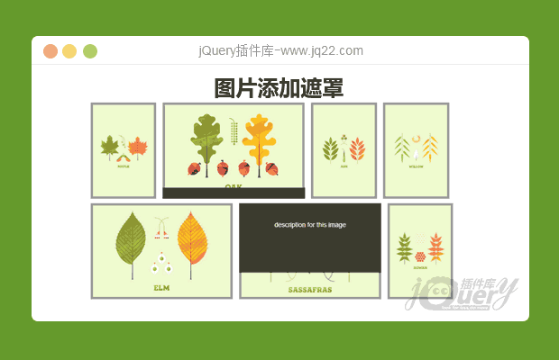
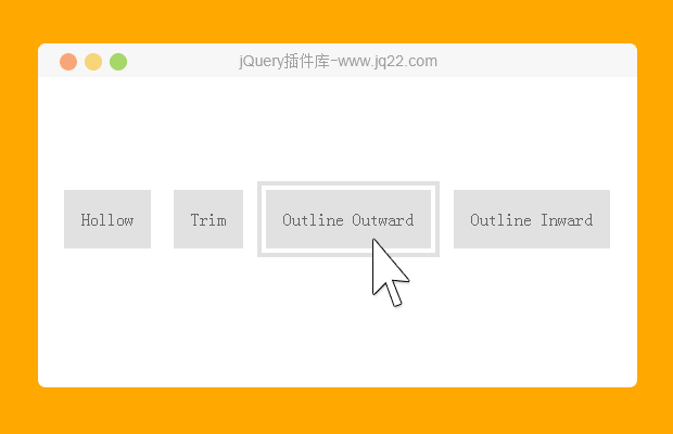
插件描述:每种效果在鼠标滑过卡片时,通过CSS3使图片和HTML元素变形生成 非常漂亮的鼠标滑过动画特效。
这是一组纯CSS3人物信息卡片UI设计效果。这组人物信息卡片共9种效果,每种效果在鼠标滑过卡片时,通过CSS3使图片和HTML元素变形生成 非常漂亮的鼠标滑过动画特效。
使用方法
HTML结构
该人物信息卡片的基本HTML结构如下:
<div class="single-member effect-3">
  <div class="member-image">
    <img src="demo.jpg" alt="">
  </div>
  <div class="member-info">
    <h3>标题</h3>
    <h5>子标题</h5>
    <p>描述信息...</p>
    <div class="social-touch">
      <a class="fb-touch" href="#"></a>
      <a class="tweet-touch" href="#"></a>
      <a class="linkedin-touch" href="#"></a>
    </div>
  </div>
</div>
CSS样式
为卡片添加一些通用样式:
.single-member{
  width: 280px;
  float: left;
  font-family: sans-sarif;
  margin: 30px 2.5%;
  background-color: #fff;
  text-align: center;
  position: relative;
}
.member-image img{
  max-width: 100%;
  vertical-align: middle;
}
h3 {
  font-size: 24px;
  font-weight: normal;
  margin: 10px 0 0;
  text-transform: uppercase;
}
h5 {
  font-size: 16px;
  font-weight: 300;
  margin: 0 0 15px;
  line-height: 22px;
}
p {font-size: 14px;
  font-weight: 300;
  line-height: 22px;
  padding: 0 30px;
  margin-bottom: 10px;
}
.social-touch a{
  display: inline-block;
  width: 27px;
  height: 26px;
  vertical-align: middle;
  margin: 0 2px;
  background-image: url(images/social-icons.png);
  background-repeat: no-repeat;
  opacity: 0.7;
  transition: 0.3s;
}
.social-touch a:hover{
  opacity: 1;
  transition: 0.3s;
}
.fb-touch{
  background-position: 0 0;
}
.tweet-touch{
  background-position: -35px 0;
}
.linkedin-touch{
  background-position: -71px 0;
}
.icon-colored .fb-touch{
  background-position: 0 -27px;
}
.icon-colored .tweet-touch{
  background-position: -35px -27px;
}
.icon-colored .linkedin-touch{
  background-position: -71px -27px;
}
第三种效果的CSS代码如下:
.effect-3{
  max-height: 302px;
  min-height: 302px;
  overflow: hidden;
}
.effect-3 h3{
  padding-top: 7px;
  line-height: 33px;
}
.effect-3 .member-image{
  border-bottom: 5px solid #e5642b;
  transition: 0.4s;
  height: 212px;
  width: 100%;
  display: inline-block;
  float: none;
  vertical-align: middle;
}
.effect-3 .member-info{
  transition: 0.4s;
}
.effect-3 .member-image img{
  width: 100%;
  vertical-align: bottom;
}
.effect-3 .social-touch{
  background-color: #e5642b;
  float: left;
  left: 0;
  bottom: 0;
  overflow: hidden;
  padding: 5px 0;
  width: 100%;
  transition: 0.4s;
}
.effect-3:hover .member-image{
  border-bottom: 0;
  border-radius: 0 0 50px 50px;
  height: 81px;
  display: inline-block;
  overflow: hidden;
  width: 109px;
  transition: 0.4s;
}
其它效果的CSS代码请参考下载文件。
PREVIOUS:
NEXT:
相关插件-悬停


讨论这个项目(9)回答他人问题或分享插件使用方法奖励jQ币 评论用户自律公约


😃
- 😀
- 😉
- 😥
- 😵
- 😫
- 😘
- 😡
- 👍
- 🌹
- 👏
- 🍺
- 🍉
- 🌙
- ⭐
- 💖
- 💔
😃
取消回复
- 😀
- 😉
- 😥
- 😵
- 😫
- 😘
- 😡
- 👍
- 🌹
- 👏
- 🍺
- 🍉
- 🌙
- ⭐
- 💖
- 💔
