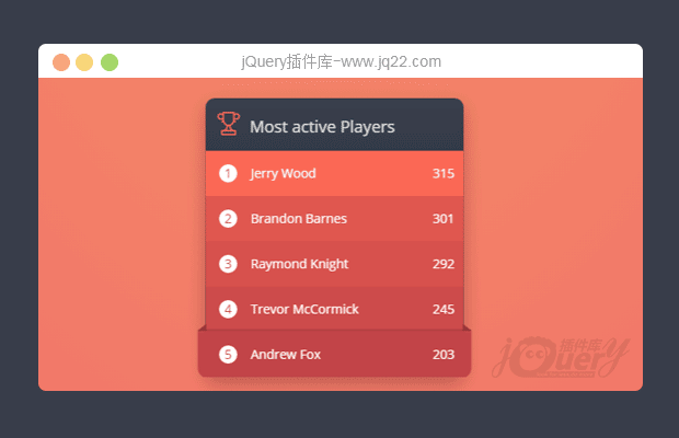


插件描述:这是一款使用CSS3制作的垂直列表面板设计效果。
实现方法
HTML结构
该列表面板的HTML结构如下:使用一个<div>元素来包裹一组有序列表元素。
<div class="leaderboard">
    <h1>
      <svg class="ico-cup">
        <use xlink:href="#cup"></use>
      </svg>
      Most active Players
    </h1>
    <ol>
      <li>
        <mark>Jerry Wood</mark>
        <small>315</small>
      </li>
      <li>
        <mark>Brandon Barnes</mark>
        <small>301</small>
      </li>
      <li>
        <mark>Raymond Knight</mark>
        <small>292</small>
      </li>
      <li>
        <mark>Trevor McCormick</mark>
        <small>245</small>
      </li>
      <li>
        <mark>Andrew Fox</mark>
        <small>203</small>
      </li>
    </ol>
  </div>
</div>
CSS样式
列表项的丝带效果使用列表项li元素的:before和:after伪元素来制作,默认情况下它们的透明度opacity为0,。
.leaderboard ol li mark {
  position: absolute;
  z-index: 2;
  top: 0;
  left: 0;
  width: 100%;
  height: 100%;
  padding: 18px 10px 18px 50px;
  margin: 0;
  background: none;
  color: #fff;
}
.leaderboard ol li mark::before, .leaderboard ol li mark::after {
  content: '';
  position: absolute;
  z-index: 1;
  bottom: -11px;
  left: -9px;
  border-top: 10px solid #c24448;
  border-left: 10px solid transparent;
  -webkit-transition: all .1s ease-in-out;
  transition: all .1s ease-in-out;
  opacity: 0;
}
.leaderboard ol li mark::after {
  left: auto;
  right: -9px;
  border-left: none;
  border-right: 10px solid transparent;
}
.leaderboard ol li small {
  position: relative;
  z-index: 2;
  display: block;
  text-align: right;
}
.leaderboard ol li::after {
  content: '';
  position: absolute;
  z-index: 1;
  top: 0;
  left: 0;
  width: 100%;
  height: 100%;
  background: #fa6855;
  box-shadow: 0 3px 0 rgba(0, 0, 0, 0.08);
  -webkit-transition: all .3s ease-in-out;
  transition: all .3s ease-in-out;
  opacity: 0;
}
当鼠标滑过列表项时,丝带的透明度opacity被设置为1,。
.leaderboard ol li:hover::after {
  opacity: 1;
  -webkit-transform: scaleX(1.06) scaleY(1.03);
          transform: scaleX(1.06) scaleY(1.03);
}
.leaderboard ol li:hover mark::before, .leaderboard ol li:hover mark::after {
  opacity: 1;
  -webkit-transition: all .35s ease-in-out;
  transition: all .35s ease-in-out;
}
完整的CSS代码请参考下载文件。
PREVIOUS:
NEXT:
相关插件-悬停
讨论这个项目(2)回答他人问题或分享插件使用方法奖励jQ币 评论用户自律公约


😃
- 😀
- 😉
- 😥
- 😵
- 😫
- 😘
- 😡
- 👍
- 🌹
- 👏
- 🍺
- 🍉
- 🌙
- ⭐
- 💖
- 💔
😃
取消回复
- 😀
- 😉
- 😥
- 😵
- 😫
- 😘
- 😡
- 👍
- 🌹
- 👏
- 🍺
- 🍉
- 🌙
- ⭐
- 💖
- 💔
