

插件描述:当鼠标移动图标上时出出相应的动画效果。
当鼠标移动图标上时出出相应的动画效果。
使用步骤
html
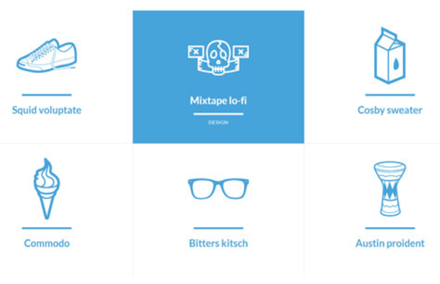
Squid voluptateFashionMixtape lo-fiDesignCosby sweaterLifestyleCommodoFoodBitters kitschGadgetsAustin proidentMusic
css
 @font-face {
    font-family: 'anyoldicon';
    src:url('../fonts/anyoldicon/anyoldicon.eot');
    src:url('../fonts/anyoldicon/anyoldicon.eot?#iefix') format('embedded-opentype'),
        url('../fonts/anyoldicon/anyoldicon.woff') format('woff'),
        url('../fonts/anyoldicon/anyoldicon.ttf') format('truetype'),
        url('../fonts/anyoldicon/anyoldicon.svg#anyoldicon') format('svg');
    font-weight: normal;
    font-style: normal;
}

/* General grid styles */
.cbp-ig-grid {
    list-style: none;
    padding: 0 0 50px 0;
    margin: 0;
}

/* Clear floats */
.cbp-ig-grid:before,
.cbp-ig-grid:after {
    content: " ";
    display: table;
}

.cbp-ig-grid:after {
    clear: both;
}

/* grid item */
.cbp-ig-grid li {
    width: 33%;
    float: left;
    height: 420px;
    text-align: center;
    border-top: 1px solid #ddd;
}

/* we are using a combination of borders and box shadows to control the grid lines */
.cbp-ig-grid li:nth-child(-n+3){
    border-top: none;
}

.cbp-ig-grid li:nth-child(3n-1),
.cbp-ig-grid li:nth-child(3n-2) {
    box-shadow: 1px 0 0 #ddd;
}

/* anchor style */
.cbp-ig-grid li > a {
    display: block;
    height: 100%;
    color: #47a3da;
    -webkit-transition: background 0.2s;
    -moz-transition: background 0.2s;
    transition: background 0.2s;
}

/* the icon with pseudo class for icon font */
.cbp-ig-icon {
    padding: 30px 0 0 0;
    display: block;
    -webkit-transition: -webkit-transform 0.2s;
    transition: -moz-transform 0.2s;
    transition: transform 0.2s;
}

.cbp-ig-icon:before {
    font-family: 'anyoldicon';
    font-size: 14em;
    speak: none;
    font-style: normal;
    font-weight: normal;
    font-variant: normal;
    text-transform: none;
    line-height: 1;
    -webkit-font-smoothing: antialiased;
}

.cbp-ig-icon-shoe:before {
    content: "e000";
}

.cbp-ig-icon-ribbon:before {
    content: "e001";
}

.cbp-ig-icon-milk:before {
    content: "e002";
}

.cbp-ig-icon-whippy:before {
    content: "e003";
}

.cbp-ig-icon-spectacles:before {
    content: "e004";
}

.cbp-ig-icon-doumbek:before {
    content: "e007";
}

/* title element */
.cbp-ig-grid .cbp-ig-title {
    margin: 20px 0 10px 0;
    padding: 20px 0 0 0;
    font-size: 2em;
    position: relative;
    -webkit-transition: -webkit-transform 0.2s;
    -moz-transition: -moz-transform 0.2s;
    transition: transform 0.2s;
}

.cbp-ig-grid .cbp-ig-title:before {
    content: '';
    position: absolute;
    background: #47a3da;
    width: 160px;
    height: 6px;
    top: 0px;
    left: 50%;
    margin: -10px 0 0 -80px;
    -webkit-transition: margin-top 0.2s; /* top or translate does not seem to work in Firefox */
    -moz-transition: margin-top 0.2s;
    transition: margin-top 0.2s;
}

.cbp-ig-grid .cbp-ig-category {
    text-transform: uppercase;
    display: inline-block;
    font-size: 1em;
    letter-spacing: 1px;
    color: #fff;
    -webkit-transform: translateY(10px);
    -moz-transform: -moz-translateY(10px);
    -ms-transform: -ms-translateY(10px);
    transform: translateY(10px);
    opacity: 0;
    -webkit-transition: -webkit-transform 0.3s, opacity 0.2s;
    -moz-transition: -moz-transform 0.3s, opacity 0.2s;
    -webkit-transition: transform 0.3s, opacity 0.2s;
}

.cbp-ig-grid li:hover .cbp-ig-category,
.touch .cbp-ig-grid li .cbp-ig-category {
    opacity: 1;
    -webkit-transform: translateY(0px);
    -moz-transform: translateY(0px);
    -ms-transform: translateY(0px);
    transform: translateY(0px);
}

/* Hover styles */

.cbp-ig-grid li > a:hover {
    background: #47a3da;
}

.cbp-ig-grid li > a:hover .cbp-ig-icon {
    -webkit-transform: translateY(10px);
    -moz-transform: translateY(10px);
    -ms-transform: translateY(10px);
    transform: translateY(10px);
}

.cbp-ig-grid li > a:hover .cbp-ig-icon:before,
.cbp-ig-grid li > a:hover .cbp-ig-title {
    color: #fff;
}

.cbp-ig-grid li > a:hover .cbp-ig-title {
    -webkit-transform: translateY(-30px);
    -moz-transform: translateY(-30px);
    -ms-transform: translateY(-30px);
    transform: translateY(-30px);
}

.cbp-ig-grid li > a:hover .cbp-ig-title:before {
    background: #fff;
    margin-top: 80px;
}


@media screen and (max-width: 62.75em) {
    .cbp-ig-grid li {
        width: 50%;
    }

    /* reset the grid lines */
    .cbp-ig-grid li:nth-child(-n+3){
        border-top: 1px solid #ddd;
    }

    .cbp-ig-grid li:nth-child(3n-1),
    .cbp-ig-grid li:nth-child(3n-2) {
        box-shadow: none;
    }

    .cbp-ig-grid li:nth-child(-n+2){
        border-top: none;
    }

    .cbp-ig-grid li:nth-child(2n-1) {
        box-shadow: 1px 0 0 #ddd;
    }
}

@media screen and (max-width: 41.6em) {
    .cbp-ig-grid li {
        width: 100%;
    }

    .cbp-ig-grid li:nth-child(-n+2){
        border-top: 1px solid #ddd;
    }

    .cbp-ig-grid li:nth-child(2n-1) {
        box-shadow: none
    }

    .cbp-ig-grid li:first-child {
        border-top: none;
    }
}

@media screen and (max-width: 25em) {
    .cbp-ig-grid {
        font-size: 80%;
    }

    .cbp-ig-grid .cbp-ig-category {
        margin-top: 20px;
    }
}
PREVIOUS:
NEXT:
相关插件-动画效果


讨论这个项目(0)回答他人问题或分享插件使用方法奖励jQ币 评论用户自律公约


济公 0
2013/9/12 14:29:00
-
您好,请教一个问题。
http:www.sd131.comcsswjimage2013071720130717121249_9774.jpg
里面的icon图标是怎么出现的,因为并没有看到img?麻烦大师指导一下下,非常感谢!
回复
😃
- 😀
- 😉
- 😥
- 😵
- 😫
- 😘
- 😡
- 👍
- 🌹
- 👏
- 🍺
- 🍉
- 🌙
- ⭐
- 💖
- 💔
😃
取消回复
- 😀
- 😉
- 😥
- 😵
- 😫
- 😘
- 😡
- 👍
- 🌹
- 👏
- 🍺
- 🍉
- 🌙
- ⭐
- 💖
- 💔
