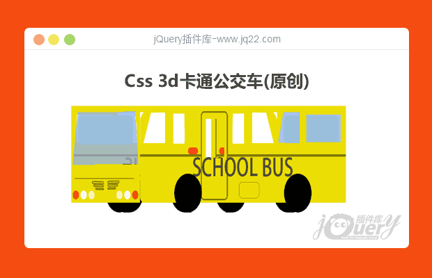


插件描述:Css3d绘制一个卡通公交车
概述 :
Css3d绘制一个卡通公交车 css3可以做一些很炫的3D效果,不过如果想绘制复杂点的图形的话还是不现实的,就比如曲面。但是通常情况下是做一些普通的特效是足够了。
css3可以做一些很炫的3D效果,不过如果想绘制复杂点的图形的话还是不现实的,就比如曲面。但是通常情况下是做一些普通的特效是足够了。
HTML
<div class="stage">
    <div class="warp">
        <div class="box">
            <div class="face top"></div>
            <div class="face bottom">

            </div>
            <div class="face front">
                <div class="window">
                    <div class="glass"></div>
                </div>
            </div>
            <div class="face back">
                <div class="window">
                    <div class="glass"></div>
                </div>
            </div>
            <div class="face left">
                <div class="wheel">
                    <div class="wheel-front">
                    </div>
                    <div class="wheel-back">
                    </div>
                </div>
            </div>
            <div class="face right">
                <div class="wheel">
                    <div class="wheel-front">
                    </div>
                    <div class="wheel-back">
                    </div>
                </div>
            </div>
            <div class="wheel-width left-front"></div>
            <div class="wheel-width left-back"></div>
            <div class="wheel-width right-front"></div>
            <div class="wheel-width right-back"></div>
            <div class="wheel-in left-front-in"></div>
            <div class="wheel-in left-back-in"></div>
            <div class="wheel-in right-front-in"></div>
            <div class="wheel-in right-back-in"></div>
        </div>
    </div>
</div>
css
.warp {
	width:400px;
	margin:5rem auto;
}
.box {
	position:relative;
	width:400px;
	height:400px;
	-webkit-transform-style:preserve-3d;
	transform-style:preserve-3d;
	transition:transform 2s;
	transform:rotateY(220deg);
	-webkit-animation:go 8s linear infinite;
	-o-animation:go 8s linear infinite;
	animation:go 8s linear infinite;
	-webkit-animation-play-state:running;
	-o-animation-play-state:running;
	animation-play-state:running;
}
@-webkit-keyframes go {
	0% {
	-webkit-transform:rotateY(0deg);
	-webkit-transform-origin:center center;
}
100% {
	-webkit-transform:rotateY(360deg);
	-webkit-transform-origin:center center;
}
}@-moz-keyframes go {
	0% {
	-moz-transform:rotateY(0deg);
	-webkit-transform-origin:center center;
}
100% {
	-moz-transform:rotateY(360deg);
	-webkit-transform-origin:center center;
}
}.box:hover {
	animation-play-state:paused;
}
.face {
	width:600px;
	height:200px;
	position:absolute;
	transform-origin:50% 50%;
	/*backface-visibility:hidden;
	*/
}
.top {
	/*background-color:red;
	*/
	background-image:url(bustop.png);
	transform:translateY(-100px) rotateX(90deg) rotateZ(90deg);
}
.bottom {
	/*background-color:green;
	*/
	background-image:url(busbotton.png);
	transform:translateY(100px) rotateX(90deg) rotateZ(90deg);
}
.left {
	/*background-color:blue;
	*/
	background-image:url(bus.png);
	-webkit-background-size:100%;
	background-size:100%;
	transform:translateX(-100px) rotateY(90deg) rotateZ(180deg);
}
.right {
	background-image:url(busleft.png);
	/*background-color:pink;
	*/
	transform:translateX(100px) rotateY(90deg) rotateZ(180deg);
}
.front {
	width:200px;
	height:200px;
	transform:translateZ(300px) translateX(200px);
	/*background-color:gray;
	*/
	background-image:url(busfront.png);
}
.back {
	background-image:url(busback.png);
	width:200px;
	height:200px;
	/*background-color:lightblue;
	*/
	transform:translateZ(-300px) translateX(200px);
}
/*轮子*/
.wheel {
	position:relative;
	width:100%;
}
.wheel>div {
	width:80px;
	height:80px;
	background-color:#000;
	border-radius:50%;
	position:absolute;
	/*background-image:url(wheel.png);
	*/
}
.wheel-front {
	bottom:-60px;
	left:100px;
}
.wheel-back {
	bottom:-60px;
	right:100px;
}
.wheel-width {
	position:absolute;
	height:100px;
	width:20px;
	background-color:#000;
	/*border-radius:4px;
	*/
}
.left-front {
	transform:translateY(120px) translateX(200px) translateZ(150px) rotateY(0deg);
}
.left-back {
	transform:translateY(120px) translateX(200px) translateZ(-150px) rotateY(0deg);
}
.right-front {
	transform:translateY(120px) translateX(380px) translateZ(150px) rotateY(0deg);
}
.right-back {
	transform:translateY(120px) translateX(380px) translateZ(-150px) rotateY(0deg);
}
/*轮子内侧*/
.wheel-in {
	width:80px;
	height:80px;
	background-color:#000;
	border-radius:50%;
	position:absolute;
	/*background-image:url(wheel.png);
	*/
}
.left-front-in {
	transform:translateY(140px) translateX(180px) translateZ(150px) rotateY(90deg);
}
.left-back-in {
	transform:translateY(140px) translateX(180px) translateZ(-150px) rotateY(90deg);
}
.right-front-in {
	transform:translateY(140px) translateX(340px) translateZ(150px) rotateY(90deg);
}
.right-back-in {
	transform:translateY(140px) translateX(340px) translateZ(-150px) rotateY(90deg);
}
/*车窗*/
.window {
	position:relative;
	width:100%;
}
.glass {
	width:160px;
	height:60px;
	left:20px;
	top:20px;
	background-color:#9abfdc;
	border-radius:10px;
	position:absolute;
}
PREVIOUS:
NEXT:
相关插件-动画效果

讨论这个项目(2)回答他人问题或分享插件使用方法奖励jQ币 评论用户自律公约


😃
- 😀
- 😉
- 😥
- 😵
- 😫
- 😘
- 😡
- 👍
- 🌹
- 👏
- 🍺
- 🍉
- 🌙
- ⭐
- 💖
- 💔
😃
取消回复
- 😀
- 😉
- 😥
- 😵
- 😫
- 😘
- 😡
- 👍
- 🌹
- 👏
- 🍺
- 🍉
- 🌙
- ⭐
- 💖
- 💔
