

插件描述:响应式jQuery消息框和通知插件可用于商业和非商业用途。
更新时间:2021-03-14 22:38:50
Lobibox分为两部分
消息框
通知
特点
Lobibox分为两部分
留言框
Lobibox消息框可以是模式的,也可以不是模式的
您可以同时显示多条消息
使用任何可用的动画类显示和隐藏消息框
每条消息都是可拖动的(在小屏幕上,禁止拖动)
你可以展示
不同颜色和图标的消息框
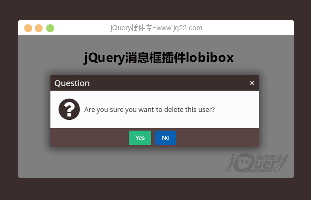
确认讯息
一行提示(提示窗口中可以使用任何HTML5输入类型。例如:文本,颜色,日期,日期时间,电子邮件,数字,范围等)
多行提示
进度消息框。 Lobibox带有默认进度样式,但是您可以使用引导程序或任何其他样式进度栏。
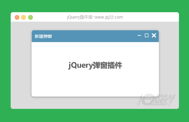
带有ajax支持和自定义操作按钮的自定义内容窗口
每个消息都是插件的一个实例。 您可以轻松地获取实例并将事件或调用方法直接附加到实例上。
通知事项
不同的颜色支持
可以在屏幕的任何位置显示
延迟
显示延迟指示器
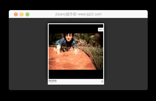
显示图片
声音支持
尺寸支持。 您可以显示不同大小的通知
安装和依赖
Lobibox仅依赖jQuery。
1,包括必要的css/js文件
<!DOCTYPE html>
<html>
<head>
  <!--Include this css file in the <head> tag -->
  <link rel="stylesheet" href="dist/css/Lobibox.min.css"/>
</head>

<body>
  ...
  <!--Include these script files in the <head> or <body> tag-->
  <script src="lib/jquery.1.11.min.js"></script>
  <script src="dist/js/Lobibox.min.js"></script>
  <!-- If you do not need both (messageboxes and notifications) you can inclue only one of them -->
  <!-- <script src="dist/js/messageboxes.min.js"></script> -->
  <!-- <script src="dist/js/notifications.min.js"></script> -->
</body>
</html>
2,调用插件方法以显示消息框或通知
留言框
确认
Lobibox.confirm({... //Options});警报
Lobibox.alert(
'error|success|warning|info', // Any of the following
{
    ... //Options
}
);
迅速的
Lobibox.prompt(
'', // Any HTML5 input type is valid
{
    ... //Options
});
进步
Lobibox.progress({
... //Options
});
窗户
Lobibox.window({
... //Options
});
选项
所有消息框的默认选项
horizontalOffset: 5,                //If the messagebox is larger (in width) than window's width. The messagebox's width is reduced to window width - 2 * horizontalOffset
verticalOffset: 5,                  //If the messagebox is larger (in height) than window's height. The messagebox's height is reduced to window height - 2 * verticalOffset
width: 600,
height: 'auto',                     // Height is automatically calculated by width
closeButton: true,                  // Show close button or not
draggable: false,                   // Make messagebox draggable
customBtnClass: 'lobibox-btn lobibox-btn-default', // Class for custom buttons
modal: true,
debug: false,
buttonsAlign: 'center',             // Position where buttons should be aligned
closeOnEsc: true,                   // Close messagebox on Esc press
delayToRemove: 200,                 // Time after which lobibox will be removed after remove call. (This option is for hide animation to finish)
delay: false,                       // Time to remove lobibox after shown
baseClass: 'animated-super-fast',   // Base class to add all messageboxes
showClass: 'zoomIn',                // Show animation class
hideClass: 'zoomOut',               // Hide animation class
iconSource: 'bootstrap',            // "bootstrap" or "fontAwesome" the library which will be used for icons

//Overriding default options
Lobibox.base.DEFAULTS = $.extend({}, Lobibox.base.DEFAULTS, {
... //override any options from default options
});
所有消息框的可用选项
Lobibox.base.OPTIONS = {//DO NOT change this value. Lobibox depended on itbodyClass       : 'lobibox-open',//DO NOT change this object. Lobibox is depended on itmodalClasses : {
    'error'     : 'lobibox-error',    'success'   : 'lobibox-success',    'info'      : 'lobibox-info',    'warning'   : 'lobibox-warning',    'confirm'   : 'lobibox-confirm',    'progress'  : 'lobibox-progress',    'prompt'    : 'lobibox-prompt',    'default'   : 'lobibox-default',    'window'    : 'lobibox-window'},//This is option how buttons can be shown. What are buttonsAlign option available valuesbuttonsAlign: ['left', 'center', 'right'],//You can change the title or class of buttons from here or use the same structure object for button when creating messagebox//closeOnClick : true will close the messagebox when clicking this type of button. Set it to false not to close messagebox when clicking on itbuttons: {
    ok: {
        'class': 'lobibox-btn lobibox-btn-default',
        text: 'OK',
        closeOnClick: true
    },
    cancel: {
        'class': 'lobibox-btn lobibox-btn-cancel',
        text: 'Cancel',
        closeOnClick: true
    },
    yes: {
        'class': 'lobibox-btn lobibox-btn-yes',
        text: 'Yes',
        closeOnClick: true
    },
    no: {
        'class': 'lobibox-btn lobibox-btn-no',
        text: 'No',
        closeOnClick: true
    }},icons: {
    bootstrap: {
        confirm: 'glyphicon glyphicon-question-sign',
        success: 'glyphicon glyphicon-ok-sign',
        error: 'glyphicon glyphicon-remove-sign',
        warning: 'glyphicon glyphicon-exclamation-sign',
        info: 'glyphicon glyphicon-info-sign'
    },
    fontAwesome: {
        confirm: 'fa fa-question-circle',
        success: 'fa fa-check-circle',
        error: 'fa fa-times-circle',
        warning: 'fa fa-exclamation-circle',
        info: 'fa fa-info-circle'
    }}};//Overriding default optionsLobibox.base.OPTIONS = $.extend({}, Lobibox.base.OPTIONS, {... //override any options except those above which is written "DO NOT change"});
确认的默认选项
title           : 'Question',
width           : 500,

//Overriding default options
Lobibox.confirm.DEFAULTS = $.extend({}, Lobibox.confirm.DEFAULTS, {
... //override any options from default options
});
提示的默认选项
width: 400,
attrs : {},         // Plain object of any valid attribute of input field
value: '',          // Value which is given to textfield when messagebox is created
multiline: false,   // Set this true for multiline prompt
lines: 3,           // This works only for multiline prompt. Number of lines
type: 'text',       // Prompt type. Available types (text|number|color)
label: ''           // Set some text which will be shown exactly on top of textfield
required: true,
errorMessage: 'The field is required'

//Overriding default options
Lobibox.prompt.DEFAULTS = $.extend({}, Lobibox.prompt.DEFAULTS, {
... //override any options from default options
});
PREVIOUS:
NEXT:
相关插件-弹出层,对话框,工具提示
😃
- 😀
- 😉
- 😥
- 😵
- 😫
- 😘
- 😡
- 👍
- 🌹
- 👏
- 🍺
- 🍉
- 🌙
- ⭐
- 💖
- 💔
😃
取消回复
- 😀
- 😉
- 😥
- 😵
- 😫
- 😘
- 😡
- 👍
- 🌹
- 👏
- 🍺
- 🍉
- 🌙
- ⭐
- 💖
- 💔
