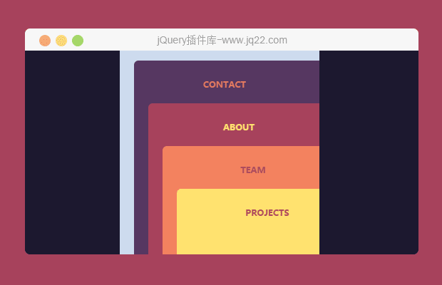


插件描述:这是一款效果非常炫酷的jQuery和CSS3堆叠卡片样式导航菜单特效。
简要教程
这是一款效果非常炫酷的jQuery和CSS3堆叠卡片样式导航菜单特效。该导航菜单特效在用户点击汉堡包按钮的时候,各个子菜单会以卡片的形式堆叠排列在视口中,点击相应的子菜单就会切换到相应的页面上。
使用方法
HTML结构
该导航菜单的HTML结构采用嵌套<div>的HTML结构,其中div.demo__close-menu是汉堡包按钮,每一个div.demo__section是一个子页面。
<div class="demo">
  <div class="demo__close-menu"></div>
  <div class="demo__section demo__section-1" data-section="1">
    <div class="demo__menu-btn"></div>
    <h2 class="demo__section-heading">Contact</h2>
  </div>
  <div class="demo__section demo__section-2 active" data-section="2">
    <div class="demo__menu-btn"></div>
    <h2 class="demo__section-heading">About</h2>
  </div>
  <div class="demo__section demo__section-3 inactive" data-section="3">
    <div class="demo__menu-btn"></div>
    <h2 class="demo__section-heading">Team</h2>
  </div>
  <div class="demo__section demo__section-4 inactive" data-section="4">
    <div class="demo__menu-btn"></div>
    <h2 class="demo__section-heading">Projects</h2>
  </div>
</div>
CSS样式
汉堡包图标按钮的样式如下:
.demo__close-menu {
  position: absolute;
  left: 22px;
  top: 22px;
  width: 29px;
  cursor: pointer;
}
.demo__close-menu:before, .demo__close-menu:after {
  content: "";
  position: absolute;
  left: 0;
  top: 8px;
  width: 100%;
  height: 4px;
  background: #7097B0;
}
.demo__close-menu:before {
  -webkit-transform: rotate(45deg);
          transform: rotate(45deg);
}
.demo__close-menu:after {
  -webkit-transform: rotate(-45deg);
          transform: rotate(-45deg);
}
堆叠卡片页面的主要CSS样式如下:
.demo {
  overflow: hidden;
  position: absolute;
  width: 100%;
  height: 100%;
  background: #CDDBEE;
  border-radius: 6px;
}

.demo__section {
  z-index: 1;
  position: absolute;
  left: 0;
  top: 0;
  width: 100%;
  height: 100%;
  padding: 25px 0 0 65px;
  border-radius: inherit;
  -webkit-transition: -webkit-transform 0.4s;
  transition: -webkit-transform 0.4s;
  transition: transform 0.4s;
  transition: transform 0.4s, -webkit-transform 0.4s;
  -webkit-transform: translate3d(0, 0, 0);
  transform: translate3d(0, 0, 0);
  will-change: transform;
}

.demo.menu-active .demo__section-1 {
  -webkit-transform: translate3d(20px, 60px, 0);
  transform: translate3d(20px, 60px, 0);
}

.demo__section-1.inactive {
  -webkit-transform: translate3d(100%, 60px, 0);
  transform: translate3d(100%, 60px, 0);
}

.demo.menu-active .demo__section-2 {
  -webkit-transform: translate3d(40px, 120px, 0);
  transform: translate3d(40px, 120px, 0);
}

.demo__section-2.inactive {
  -webkit-transform: translate3d(100%, 120px, 0);
  transform: translate3d(100%, 120px, 0);
}

.demo.menu-active .demo__section-3 {
  -webkit-transform: translate3d(60px, 180px, 0);
  transform: translate3d(60px, 180px, 0);
}

.demo__section-3.inactive {
  -webkit-transform: translate3d(100%, 180px, 0);
  transform: translate3d(100%, 180px, 0);
}

.demo.menu-active .demo__section-4 {
  -webkit-transform: translate3d(80px, 240px, 0);
  transform: translate3d(80px, 240px, 0);
}

.demo__section-4.inactive {
  -webkit-transform: translate3d(100%, 240px, 0);
  transform: translate3d(100%, 240px, 0);
}

.demo.menu-active .demo__section { cursor: pointer; }

.demo__section-heading {
  text-transform: uppercase;
  font-size: 12px;
  -webkit-transition: -webkit-transform 0.4s;
  transition: -webkit-transform 0.4s;
  transition: transform 0.4s;
  transition: transform 0.4s, -webkit-transform 0.4s;
}

.demo.menu-active .demo__section-heading {
  -webkit-transform: translateX(-45px);
  transform: translateX(-45px);
}
JavaScript
该特效中使用jQuery代码来处理汉堡包按钮的点击事件和堆叠卡片菜单的切换事件。
$(document).ready(function () {
    var $demo = $('.demo');
    var numOfSections = $('.demo__section').length;
    $(document).on('click', '.demo__menu-btn', function () {
        $demo.addClass('menu-active');
    });
    $(document).on('click', '.demo__close-menu', function () {
        $demo.removeClass('menu-active');
    });
    $(document).on('click', '.demo.menu-active .demo__section', function () {
        var $section = $(this);
        var index = +$section.data('section');
        $('.demo__section.active').removeClass('active');
        $('.demo__section.inactive').removeClass('inactive');
        $section.addClass('active');
        $demo.removeClass('menu-active');
        for (var i = index + 1; i <= numOfSections; i++) {
            if (window.CP.shouldStopExecution(1)) {
                break;
            }
            $('.demo__section[data-section=' + i + ']').addClass('inactive');
        }
        window.CP.exitedLoop(1);
    });
});
PREVIOUS:
NEXT:
相关插件-手风琴菜单
讨论这个项目(1)回答他人问题或分享插件使用方法奖励jQ币 评论用户自律公约

😃
- 😀
- 😉
- 😥
- 😵
- 😫
- 😘
- 😡
- 👍
- 🌹
- 👏
- 🍺
- 🍉
- 🌙
- ⭐
- 💖
- 💔
😃
取消回复
- 😀
- 😉
- 😥
- 😵
- 😫
- 😘
- 😡
- 👍
- 🌹
- 👏
- 🍺
- 🍉
- 🌙
- ⭐
- 💖
- 💔
