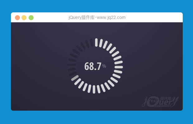


插件描述:这是一款效果非常炫酷的HTML5可交互的圆形进度条特效。这个圆形进度条由32个圆角矩形组成,用户可以点击每一个圆角矩形将进度条设置到相应的刻度上。它使用js来制作交互动画效果,并带有鼠标滑过时的效果,非常的酷。
制作方法
HTML结构
组成这个圆形进度条的32个圆角矩形每一个实际上是input.radio和<label>的组合。div.barPie__value用于显示当前进度的百分比值。包裹容器中的data-to-value用于圆形进度条的初始值。
<div data-to-value='85' data-items-count='32' id="p1_barPie" class="barPie barPie--radio">
  <span class="barPie__value">0</span>
  <div class="barPie__ring">
    <input type="radio" name="barPieRadioGroup" id="p1_barPieItem31" value="100" hidden="hidden"/>
    <label for="p1_barPieItem31" class="barPie__ring__item"></label>
    ......
  </div>
</div>
CSS样式
整个圆形进度条设置了固定的宽度和高度,并设置居中显示。
.barPie--radio {
  margin: 20px;
  width: 400px;
  height: 400px;
  text-align: center;
  font: 700 50px 'Open Sans Condensed', sans-serif;
  position: absolute;
  top: 0;
  left: 0;
  bottom: 0;
  right: 0;
  margin: auto;
}
并使用perspective属性来制作透视效果。
.barPie {
  -webkit-perspective: 1000px;
          perspective: 1000px;
}
所有的圆角矩形都是由<label>元素来制作,通过将它们进行不同角度的旋转,组成一个圆形。
.barPie__ring__item {
  position: absolute;
  width: 34px;
  height: 50%;
  top: 0;
  left: 50%;
  margin-left: -17px;
  -webkit-transform-origin: 50% 100%;
      -ms-transform-origin: 50% 100%;
          transform-origin: 50% 100%;
  -webkit-transition: .1s;
          transition: .1s;
}
.barPie__ring__item:nth-of-type(1) {
  -webkit-transform: rotate(11.25deg);
      -ms-transform: rotate(11.25deg);
          transform: rotate(11.25deg);
}
.barPie__ring__item:nth-of-type(1)::before {
  -webkit-transition-delay: 12ms;
          transition-delay: 12ms;
}
...
<label>元素的:before伪元素用于制作圆角矩形的槽,它们的颜色被设置为0.15透明度的白色。并在鼠标滑过时设置它们的透明度为0.7,它的兄弟节点的透明度为0.4。
.barPie__ring__item::before {
  content: '';
  display: block;
  width: 50%;
  height: 30%;
  border-radius: 10px;
  background: rgba(0, 0, 0, 0.15);
  box-shadow: 0 0 0 1px rgba(255, 255, 255, 0.05), 0 0 4px rgba(0, 0, 0, 0.33) inset;
  -webkit-transition: .3s;
          transition: .3s;
}
.barPie__ring__item:hover::before {
  opacity: .7;
}
.barPie__ring__item:hover::before,
.barPie__ring__item:hover ~ .barPie__ring__item::before {
  background: rgba(255, 255, 255, 0.4);
  -webkit-transition: 0s !important;
          transition: 0s !important;
}
处于checked状态的圆角矩形设置为80%透明度的白色。
.barPie__ring :checked ~ .barPie__ring__item::before {
  background: rgba(255, 255, 255, 0.8);
  box-shadow: 0 0 4px rgba(255, 255, 255, 0.5);
  -webkit-transition: 0s;
          transition: 0s;
}
具体的javascript实现代码请参考下载文件。
PREVIOUS:
NEXT:

讨论这个项目(6)回答他人问题或分享插件使用方法奖励jQ币 评论用户自律公约


😃
- 😀
- 😉
- 😥
- 😵
- 😫
- 😘
- 😡
- 👍
- 🌹
- 👏
- 🍺
- 🍉
- 🌙
- ⭐
- 💖
- 💔
😃
取消回复
- 😀
- 😉
- 😥
- 😵
- 😫
- 😘
- 😡
- 👍
- 🌹
- 👏
- 🍺
- 🍉
- 🌙
- ⭐
- 💖
- 💔
